How does the risk of death change as we age – and how has this changed over time?
Death rates decline rapidly after birth but rise again in adolescence. From adulthood onwards, they rise exponentially.
Infants and the elderly have the highest risks of death. What about other age groups?
Graphing death rates across the lifespan shows that the relationship resembles a J-shaped curve: death rates decline rapidly after birth, but rise again in adolescence. From adulthood onwards, they rise exponentially.
Why do death rates follow this curve?
In this article, I describe how death rates change with age and explain why that is. I will also show how the curve has changed over time.
How do death rates change as people age?
The risk of death in the first year of life
Intuitively, death rates are high among older people. But the first few days and weeks of life are also very risky. So let’s start by looking at the risks of death during infancy.
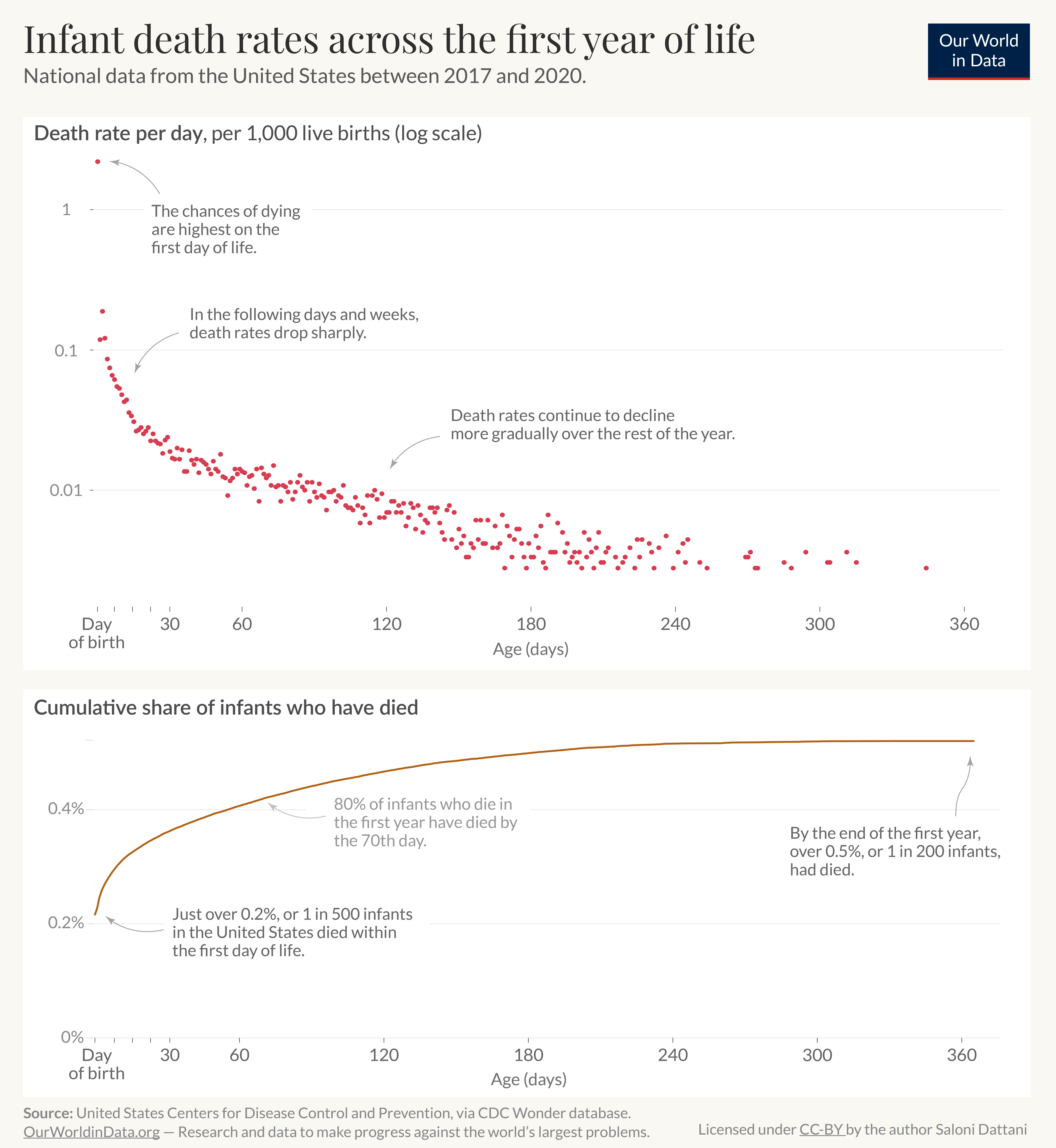
You can see this in the chart. This data comes from the United States and covers all births registered between 2017 and 2020.1
The upper panel shows the per-day death rate per 1,000 live births among infants – babies younger than one year.
As you can see, death rates are highest on the day of birth: this is when a baby is introduced to a new environment, which is a sudden change. Some newborns die from birth complications, suffocation and trauma, sepsis, and other conditions.
These risks are still relatively high over the following days and weeks but decline sharply. One reason is that the most vulnerable infants tend to die earlier.2
Over the next months, the risks continue to decline, but at a slower rate. During this time, a baby’s vital organs – such as their immune system and lung capacity – become more developed, which makes them more capable of survival.3
The lower panel shows how the per-day death rate accumulates to the total death rate across the first year of life.
You can see that most infant deaths occurred in the first few months: 80% of the infants that died in the first year of life had died by the 70th day.

The risk of death during childhood, adolescence, and adulthood
After the first year of life, death rates continue to decline through childhood.
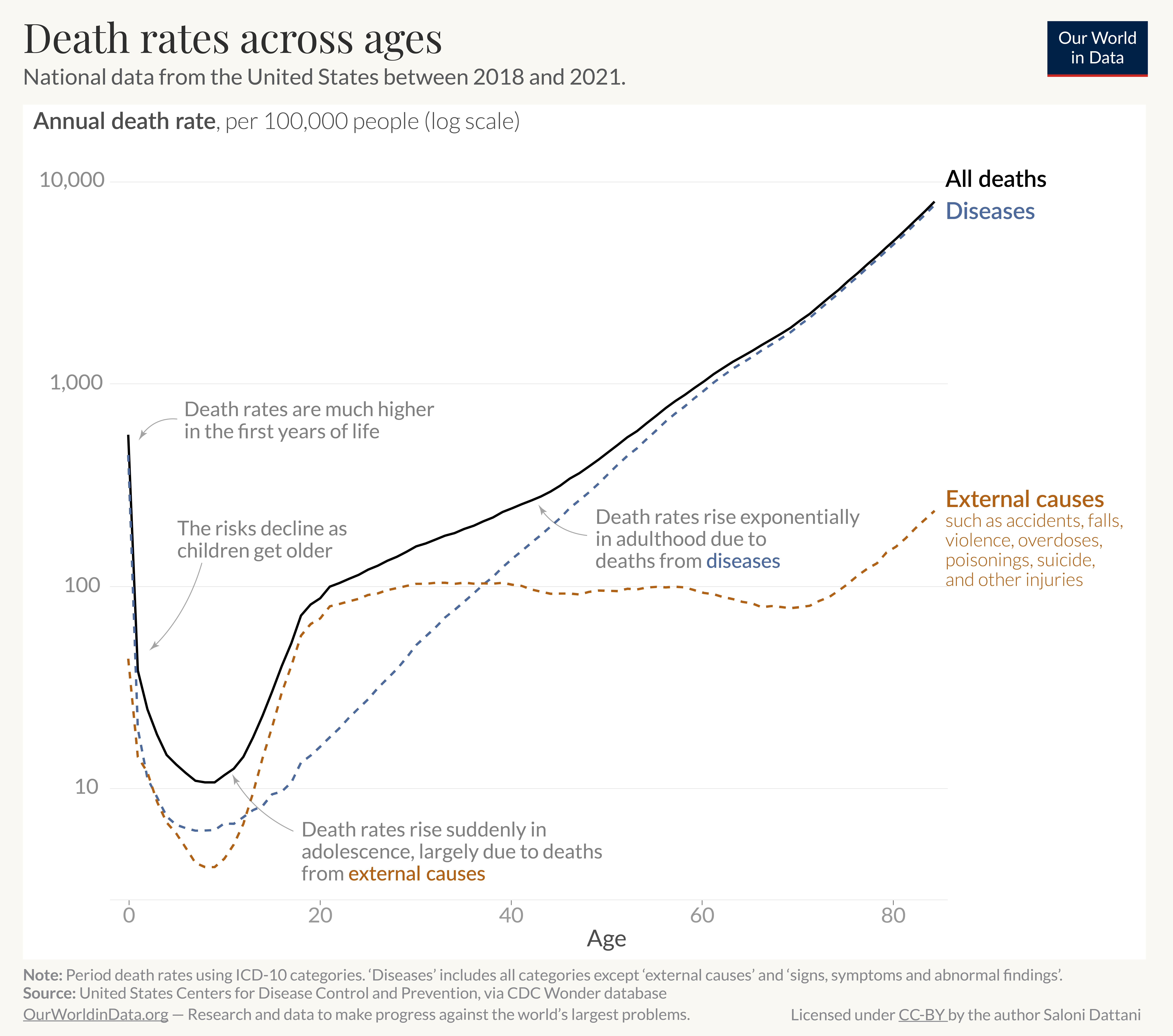
This chart visualizes annual death rates across age groups, using national data from the United States, which covers all births registered between 2018 and 2021.4
The chart uses a log scale, which shows that the risk reduction during childhood is very dramatic.
For example, during these years, a ten-year-old child’s risk of dying was almost fifty times lower than an infant’s.5
In adolescence, however, death rates rise again suddenly, which looks like a hump.
As you can see, this is mainly due to a rise in deaths from external causes (shown in orange), which include accidents, falls, overdoses, poisonings, violence, suicides, and other injuries. Deaths from these causes then remain roughly stable until old age.
Research shows that the precise shape and timing of the hump varies between countries and changes over time.6
However, the total death rate continues to rise across adulthood due to increased deaths from diseases.7
You can see that the rise becomes exponential8 – for example, 80-year-olds are around ten times more likely to die than 60-year-olds.
As we age, our cells get damaged by injury, stress, and DNA mutations. Because of this, our organs deteriorate. This makes us more vulnerable to additional damage, and our body becomes less able to repair itself.9
Research suggests that this leads to an exponentially growing risk of developing many diseases – including cancers, cardiovascular diseases, infectious diseases, dementias, and others – which increase death rates overall.10

How have death rates changed over time?
Although death rates are very high in infancy and increase exponentially during adulthood, these risks are much lower than in the past.
We can see this by looking at data on infant death rates over time and extending this to look at how the entire curve has changed over the centuries.
Each day of infancy is much safer than it was in the past
In our work on Child and Infant Mortality, we show how there have been dramatic declines in child deaths across the world.
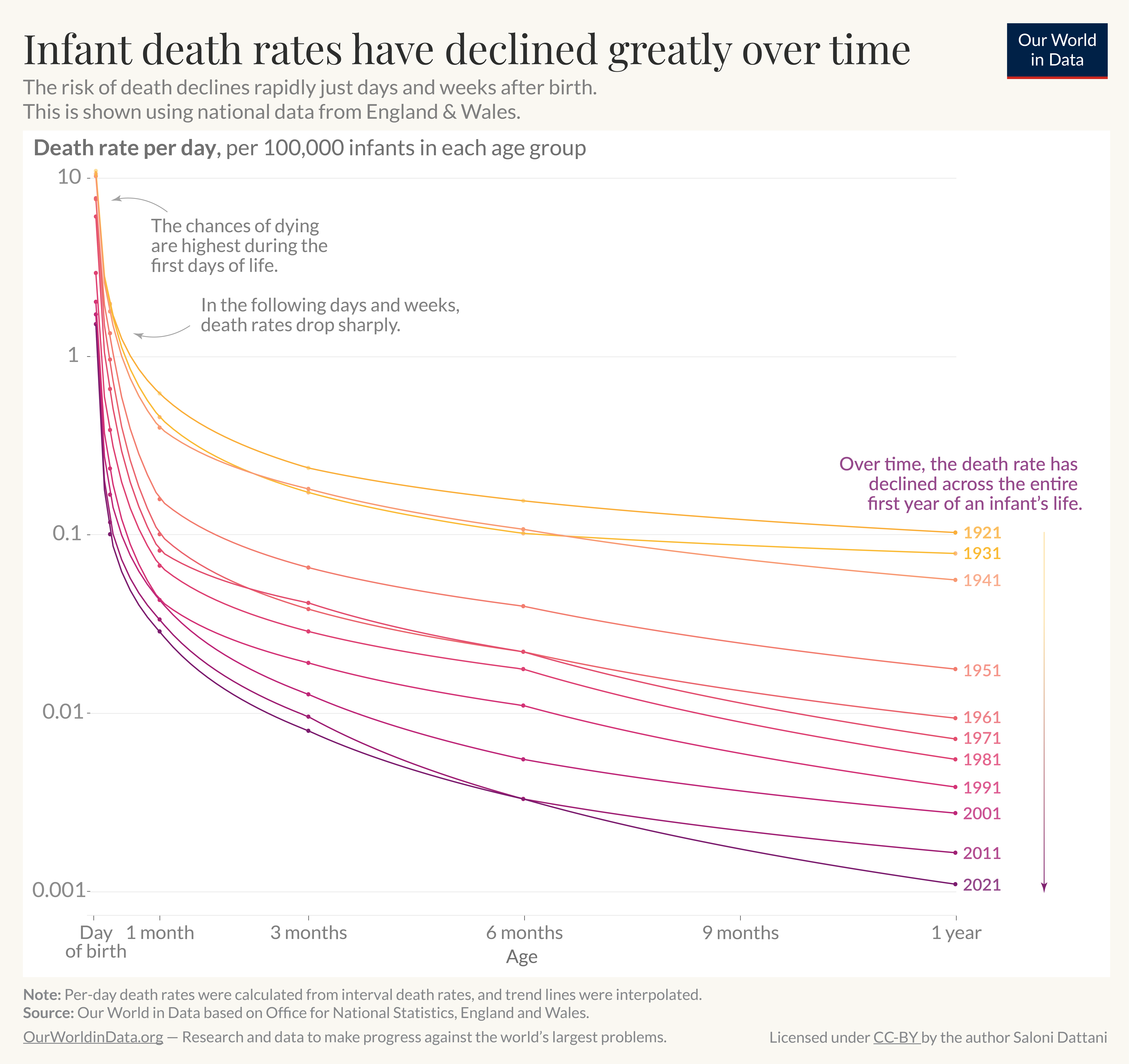
This reduction in risk starts on the very first day of life, as you can see in the chart. It shows how death rates across infancy have changed over time.
The data comes from the Office for National Statistics in England and Wales, which has historical data on death across the first year of life.11
As you can see, the entire trend line has shifted downwards – each day of infancy is much safer than in the past.
The chart is plotted on a log scale. The death rates on the first day of life were about seven times lower in 2021 than they were a century before.
The risk of dying at the end of the first year of life – at the time of a babyʼs first birthday – was around 100 times lower in 2021 than in 1921.

Death rates have declined over generations, across the lifespan
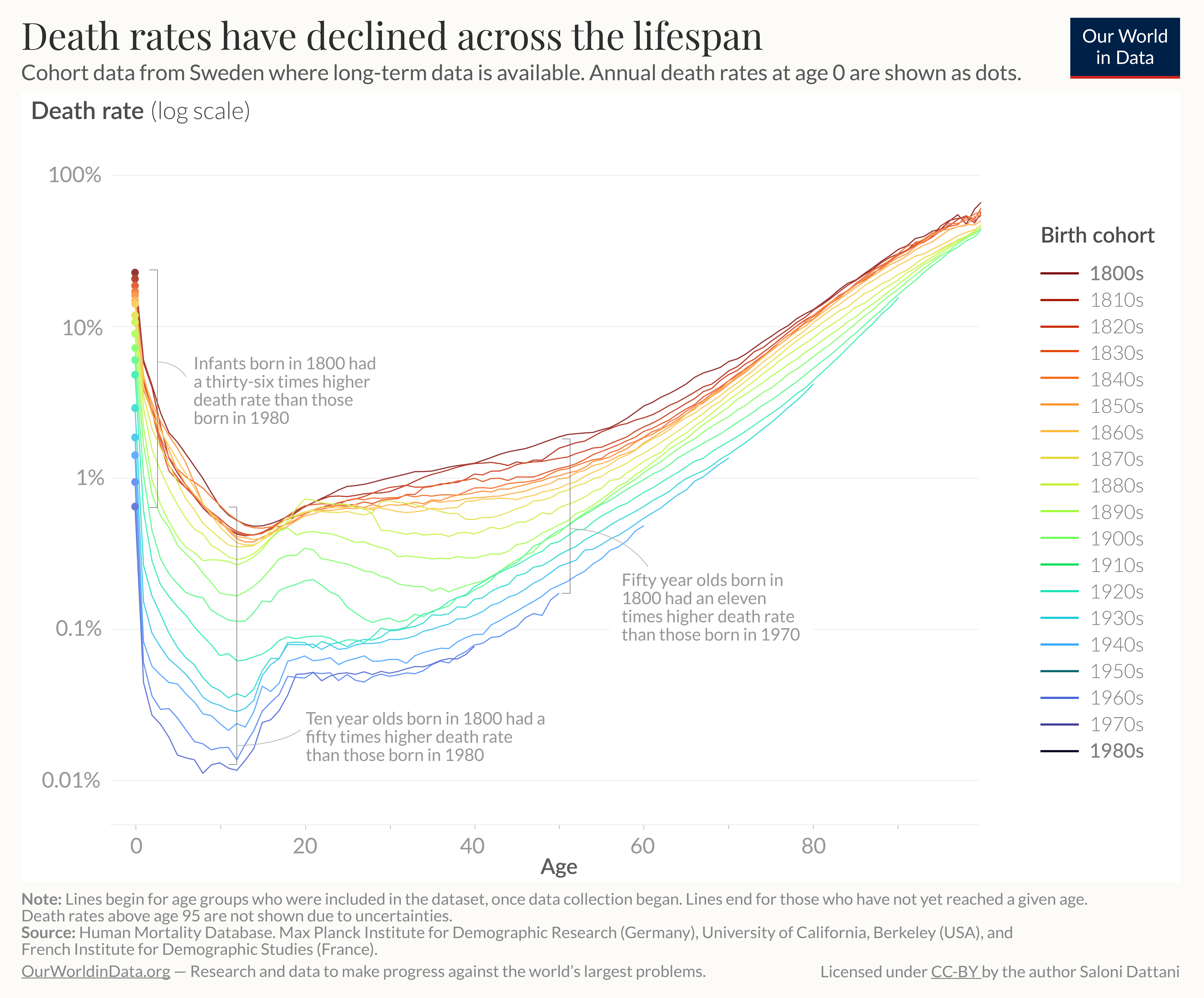
In the chart, you can see how death rates across the lifespan have changed over time.
The data comes from Sweden, which has data from the entire population over time.12 It shows the annual death rate as a percentage – the share who died in a given year.

As you can see, people born more recently have lower death rates. This is true across their lifespans.
For example, during infancy, those born in 1980 in Sweden had a 36 times lower annual death rate than those born in 1800.
Among children, the decline was even more extensive. 10-year-olds born in Sweden in 1980 had a fifty-times lower annual death rate than those born in 1800.
The decline in mortality is also seen among older people. Even when each group reached 50, those born in 1970 Sweden had an 11 times lower annual death rate than those born in 1800.
The chart also shows the impact of significant events, such as the two World Wars, on death rates. People born between the 1890s and 1920s had a much higher risk of death when they reached youth and early adulthood.
You can also see that the hump during adolescence and young adulthood is more prominent in recent generations.13
Conclusion
The day a child is born is the most dangerous day of life.
After birth, a child’s risk of dying declines rapidly across the first year of life. Risks continue to decline over the next few years but suddenly rise again during adolescence. Finally, in adulthood, the chances of dying grow exponentially.
If you plot the risk of dying against age, it looks like a J-shaped curve or a hook.
Across a historical timeframe, however, the whole curve has shifted downwards – the annual rates of death have declined across all age groups.
Endnotes
Data comes from the US Centers for Disease Control and Prevention (CDC), from the CDC Wonder database. To recreate this chart, you can find scripts here.
Berrut, S., Pouillard, V., Richmond, P., & Roehner, B. M. (2016). Deciphering infant mortality. Physica A: Statistical Mechanics and Its Applications, 463, 400–426. https://doi.org/10.1016/j.physa.2016.07.031
Schöley, J. (2019). The age-trajectory of infant mortality in the United States: Parametric models and generative mechanisms. Annual Meeting of the Population Association of America, Austin, TX. Available here.
Data comes from the US Centers for Disease Control and Prevention (CDC), from the CDC Wonder database. To recreate this chart, you can find scripts here.
The annual death rate among ten-year-olds between 2018 and 2021 in the United States was 11.6 per 100,000 people in that age group. Among infants (aged under 1), the rate was 548 per 100,000, which is 47 times higher.
The lowest death rate was among eight-year-olds during this period. The age with the lowest risk may vary between countries and over time.
Remund, A., Camarda, C. & Riffe, T. (2021). Is young adult excess mortality a natural phenomenon? Population & Societies, 590, 1-4. https://doi.org/10.3917/popsoc.590.0001 Available here.
Lleras-Muney, A., & Moreau, F. (2022). A Unified Model of Cohort Mortality. Demography, 59(6), 2109–2134. https://doi.org/10.1215/00703370-10286336
This is visible as the trend appears as a straight line, which represents an exponential change on a log scale.
Peters, R. (2006). Ageing and the brain. Postgraduate Medical Journal, 82(964), 84–88. https://doi.org/10.1136/pgmj.2005.036665
Rodgers, J. L., Jones, J., Bolleddu, S. I., Vanthenapalli, S., Rodgers, L. E., Shah, K., Karia, K., & Panguluri, S. K. (2019). Cardiovascular Risks Associated with Gender and Aging. Journal of Cardiovascular Development and Disease, 6(2), 19. https://doi.org/10.3390/jcdd6020019
Sas, A. A., Snieder, H., & Korf, J. (2012). Gompertz’ survivorship law as an intrinsic principle of aging. Medical Hypotheses, 78(5), 659–663. https://doi.org/10.1016/j.mehy.2012.02.004
Data comes from the Office for National Statistics in England and Wales. To recreate this chart, you can find scripts here.
Data comes from the Human Mortality Database. To recreate this chart or create it for other countries, you can find scripts here.
This may be partly due to the significant decline in deaths from diseases and changes in some external causes of death, such as a rise in road accidents.
Remund, A., Camarda, C. G., & Riffe, T. (2018). A Cause-of-Death Decomposition of Young Adult Excess Mortality. Demography, 55(3), 957–978. https://doi.org/10.1007/s13524-018-0680-9
Remund, A., Camarda, C. & Riffe, T. (2021). Is young adult excess mortality a natural phenomenon? Population & Societies, 590, 1-4. https://doi.org/10.3917/popsoc.590.0001 Available here.
Cite this work
Our articles and data visualizations rely on work from many different people and organizations. When citing this article, please also cite the underlying data sources. This article can be cited as:
Saloni Dattani (2023) - “How does the risk of death change as we age – and how has this changed over time?” Published online at OurWorldInData.org. Retrieved from: 'https://ourworldindata.org/how-do-the-risks-of-death-change-as-people-age' [Online Resource]BibTeX citation
@article{owid-how-do-the-risks-of-death-change-as-people-age,
    author = {Saloni Dattani},
    title = {How does the risk of death change as we age – and how has this changed over time?},
    journal = {Our World in Data},
    year = {2023},
    note = {https://ourworldindata.org/how-do-the-risks-of-death-change-as-people-age}
}
Reuse this work freely
All visualizations, data, and code produced by Our World in Data are completely open access under the Creative Commons BY license. You have the permission to use, distribute, and reproduce these in any medium, provided the source and authors are credited.
The data produced by third parties and made available by Our World in Data is subject to the license terms from the original third-party authors. We will always indicate the original source of the data in our documentation, so you should always check the license of any such third-party data before use and redistribution.
All of our charts can be embedded in any site.

